Some call it a Youtube intro, others call it your Youtube logo, or a Youtube bumper. It is your logo – but in video format. It is what you put at the beginning of your videos to brand it and quickly show your viewers the personality of your channel.
There are only 3 things to keep in mind when creating your Youtube intro. And here they are:
✓ 5 seconds
✗ 5++ seconds
✓ animated/movement
✗ still logo image
✓ added sound effects
✗ no sound to go with the logo
This is what movies and videos are about – moving images with sound. So it makes sense for your Youtube intro logo to have some movement to it, with added sound effects. Animate your logo.
A common mistake a lot of channels make, is having really long intros. By long I mean 10+ seconds. Keeping it to 5 seconds or less means that you hold the viewers attention and give them a taste of what your channel is about, without making it annoying for them. Look at Netflix, they even have a button to skip intros for TV shows. If you look at my favorite Youtube bumpers below, they are all under 5 seconds.
One other tip: Have a few seconds of video/content before the logo intro reveal – this is so that you ease people into the video – just like on tv shows. The examples below all do this too.
Here are a few of my top favorite Youtube intros:
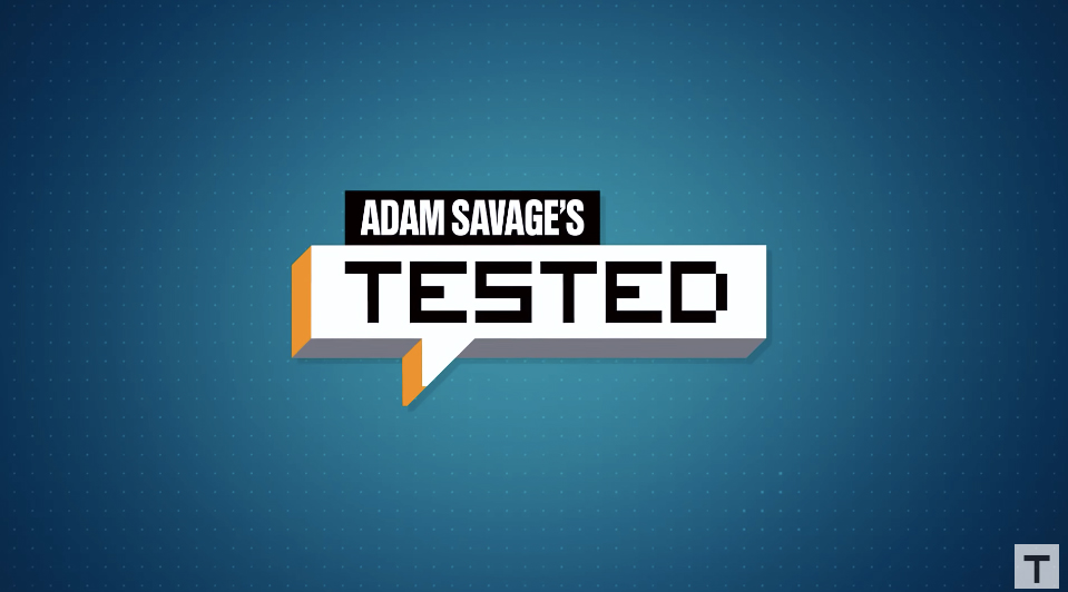
Adam Savage’s Tested – 3 Seconds

–
Simone Giertz – 2 seconds

–
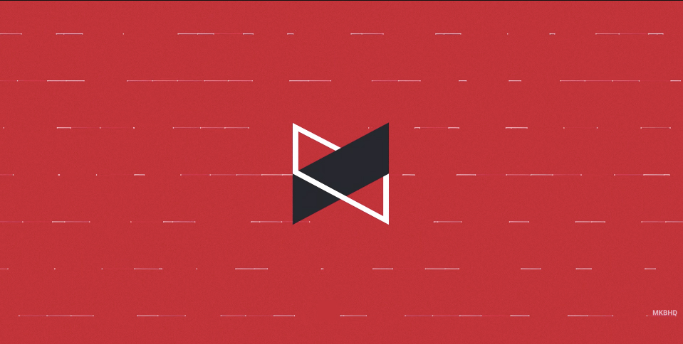
Marques Brownlee (MKBHD) – 5 seconds

–
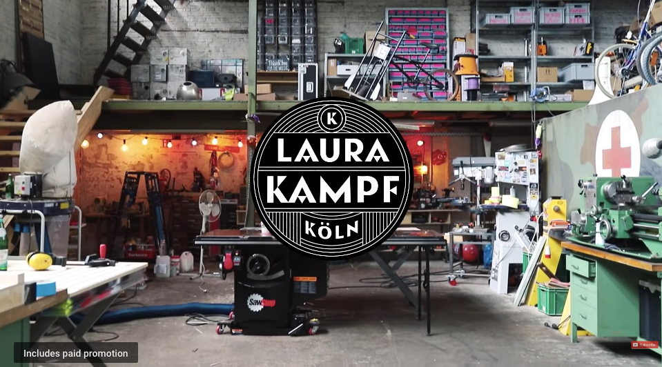
Laura Kampf – 0 seconds (since it is on top of the video footage)

