• Skip to primary navigation
  • Skip to content
  • Skip to primary sidebar
Graphic Design For Bloggers

Hatch Design Workshop

Graphic Design For Bloggers

  • Start Here – Topics
  • Custom Logo Design
  • My Shop
  • Contact

How To Hire A Logo Graphic Designer – Custom Logo Design And Price

Topics: Logo Design

How To Hire A Logo Graphic Designer Custom Branding

Where do you start when it comes to hiring a graphic designer to design a logo for you? Start by knowing what you want, and being clear with what you want. As this will make working with a logo designer a lot easier.

Here are the 3 things I go over in this post:

  • Things To Know Before Looking For a Logo Designer
  • How To Find The Right Designer For You
  • Where to Find a Logo Designer – $ vs $$

Things To Know Before Looking For a Logo Designer

1. Know The True Cost of a Custom Logo Design

Big agencies and famous designers can charge up to $5,000, $10,000, $20,000+ just for a logo design.

So when you find a logo designer who charges say $100, know that can be a reasonable price. And designers price their work based on the time they will spend on your logo, the experience they have, and what items they will deliver.

Also know that any small ‘added’ changes or extras – might sound simple to you, but take time for a designer to create. Say you want an extra jpg of the logo in a different color. Sounds simple and fast, but that is extra work for the designer that was not included in the original offer – so ask how much it would cost for anything extra.

2. Know The Right Budget

If you have a brand new blog, I would recommend spending between $100 – $300+ for custom logo branding. Yes you can definitely find people cheaper than this. But this is a good amount to spend, since you will get the right amount of quality that is needed for a new blog.

The only exception to this, is if you are creating physical items, or products that will need the branding printed. Since then you want to invest a solid amount, since you don’t want to be reprinting anything later on.

You don’t want to spend too much money early on. Because no one is really looking at your blog when you start. It is better to use your funds to create content and build up your viewers first. Then when you start getting more viewers and media coverage, then you can invest in higher end branding ($300+).

Things Change – Once you start getting more viewers, you will have a better understanding of who is looking at your blog, and also have a better understanding of who you are as a blogger. You might start out as a food blog that covers Asian cuisine, but after a few months – you realize that you enjoy mostly posting about family life and family based recipes. So this would mean needing to rebrand the blog.

3. Know What You Want

Before you start looking for a logo designer, you need to know what you want.

If you have no idea of what you want, then you would need a separate service called brand strategy. This is a deep dive into who you want to be as a brand, and what would attract your target audience to you – and finding the right way to balance these things into a visual way. A lot of logo designers can do this, but it will most likely be a different service, before the actual logo design.

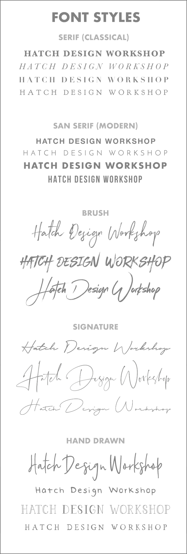
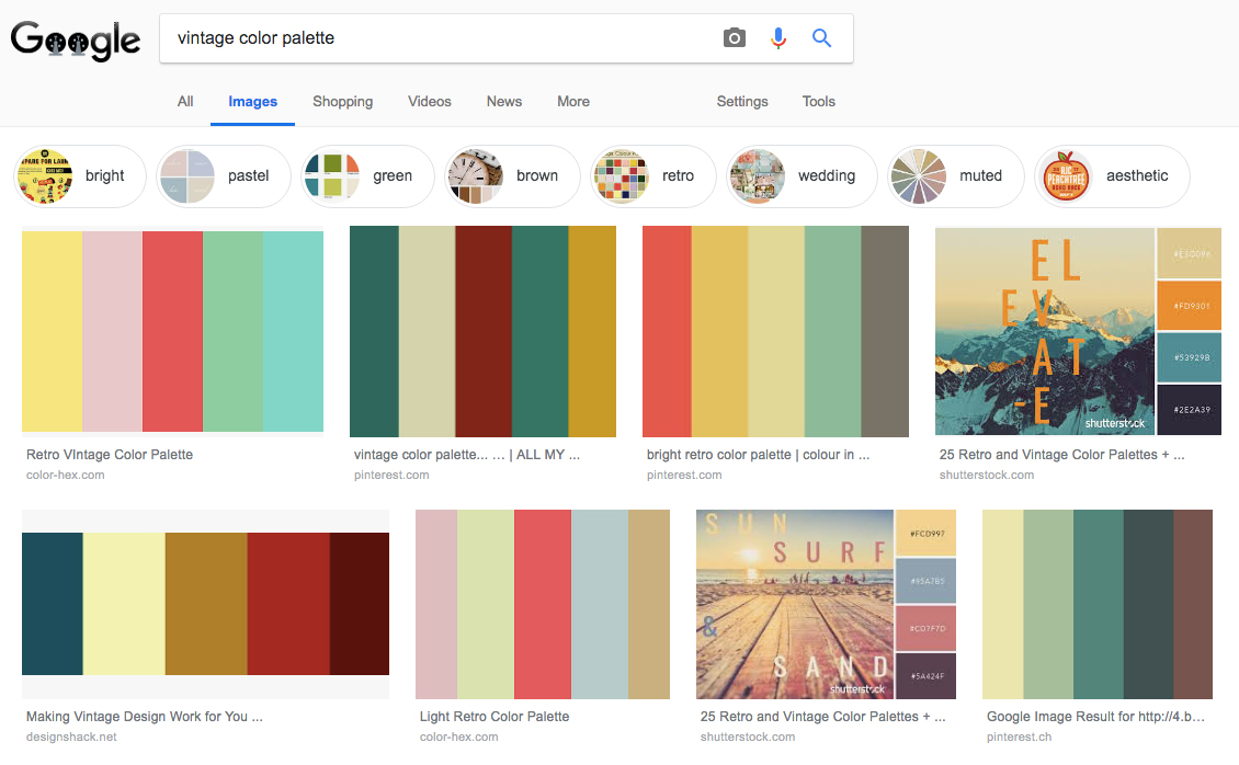
I would recommend coming up with an idea of what sort of logo you want before looking for a designer. If you are a travel blogger – go onto Pinterest and look up travel blogs, and travel logos. See what catches your eye, and figure out what style fits with what you want to create. Do you want a modern logo (clean lines, modern font), something a bit more down to earth and hand drawn, or do you want your blog to have a more authentic look – then maybe a vintage logo design.

Be Really Clear: Take time to think about what you want your blog to stand for, and how it should look. You want to be clear when talking to your designer about what you want. “Maybe I want a vintage logo, or maybe a modern one” – that won’t get you good results. If a designer ends up working based on those instructions, then half their time is spent trying to figure out what your logo would look like with a vintage style, and half the time with a modern style. Whereas they could be spending 100% of their time making it look perfect in one of those styles, and creating different options for you to see.

Collect a group of logo designs that are the same style as the logo you want created. And send these to your designer so you are both really clear on what you want before getting started.  Sending images is the best way to communicate about things when it comes to design work – versus trying to explain by text. 

3. Know What Makes a Good Logo Design

I have a whole post on this here (Getting it Right: What Makes a Good Logo Design).

But some quick tips includes:

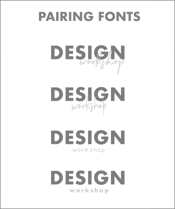
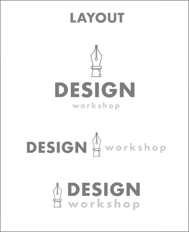
  • Don’t try to fit in more than one graphic into your logo.
  • Keep your tagline short – 3 words or less work best
  • Most of all, trust your designer. You are paying them to be the expert. So don’t start choosing which font to use, add in a lot of other graphics, make the decisions on how to lay out the logo, or ask them to use a lot of different colors.

How To Find The Right Logo Designer For You

Here are a few things to keep in mind, when you are looking at different logo designers:

  • Know what you want. This comes from the section above, about knowing what style you want for your logo design.
  • Look at examples of their work, and see if they have examples of work that match the style that you are going for. If you need something a little different, contact them to see if they can work on it.
  • Look at what items they will deliver with their packages – most logo designers will create JPGs, transparent PNGS (which you can put on top of photographs), and the source file (so that you can go to printers to have things printed, or edit the logo in the future (change colors, size, etc.)). If you need something else, make sure you bring it up before starting.

Where to Find a Logo Designer

There are a few platforms where you can easily find logo designers. But I feel the quality is somewhat limited on these platforms.

$50 or less – Fiverr – you might hear people talk about Fiverr. But I would not recommend this site. If you want a really cheap logo, then alright. But it might be a hit or miss finding a good designer who will take their time to work with you. Since it is a cheap service, designers need to work fast and move on to the next order to make a living.

Around $100 – Etsy – is a good place to find custom logo designers. People are more patient on Etsy, and are friendlier.

–

$200-$400+ – Independent Designers – Premium Logos – if you have a higher budget $200+, I would recommend spending the time finding a designer outside of those platforms. You can find much more polished logo designers, and the logo you create will have a much more professional and polished look to it. You won’t need to upgrade it later on.

It is harder to find a designer on your own like this, outside of a platform. But it is worth it in the long run. I have worked on those platforms, and now on my own. Before I would have a large % of the money being paid, given to the platform. Now I have more time to work with people that fit my style. I can work on higher end logos and can work more closely with people who need to brand their blog.

Some places to look for these kinds of designers:

  • Join a membership group, like Food Blogger Pro if you are a food blogger. People talk in the forums about who they used to design their logo.
  • Use Instagram to search #logodesign, #logodesigner
  • Behance is a graphic design portfolio site that you can search for logo designers
  • The best place to search though, would be Pinterest. Just searching “custom logo design” pops up a lot of independent designers

The tricky part is finding a graphic designer in your price range. You will need to contact them to find out prices, and details about ordering a logo. That is why I like to include everything (price, what’s included, etc) on my custom logo page, just to make it easier for people to know what the packages are without needing to contact first.

So some designers, after contacting them, might be completely out of your price range. But this is alright. if you really like their work, save them as examples of the style you want – which you can show to a designer who is more in your price range.

Now you should be ready to go out and find a graphic designer that you can hire and communicate with to create your custom blog logo.

Take a look at my custom logo page, to see if I am a match for what you need designed – Custom Logo Branding Design.

Hand Drawn Floral Logo Design Social Media
Hand Drawn Camera Photography Logo Design Floral
Hand Drawn Floral Logo Design Writer Vintage
previous arrow
next arrow
Slider
–
Hand drawn floral logos from my portfolio
–

Recommended Reading:

  • Off Grid Living News Logo Case Study: Ordering a Custom Blog Logo
  • How To Know Which Colors Work Best For Your Brand

Topics: Logo Design

The Blank Canvas: How To Create A Professional Looking Blog Cheaply

Topics: Website Design

How To Design A Blog Website

When I create a new website, I look for the most basic WordPress theme I can find. And I try to take away as much of the ‘features’ and ‘bells and whistles’ of the theme as possible. Because I know I can turn a completely blank canvas, into a great looking blog by focusing on just 4 main areas:

  1. Have a great looking logo
  2. Add sidebar graphics
  3. Have great looking blog title images
  4. And choose the right font for the text (main blog text, and headers/titles)

By focusing on these 4 areas you don’t need to spend a lot of money on a blog theme to get you started.

A big problem I had when starting my home design website (and understanding how to build/edit websites), was that when I bought a WordPress theme that had great looking features (sliders, fancy layouts, etc) – things would break on the site anytime I would try to make a simple change to the design. These themes work great out of the box – but wanting to try and change things can quickly mess things up.

1. A Great Looking Logo

Not only is having a great looking logo important because it represents who you are and what you do, but it is the first thing people will see on your blog. Since it is right at the top of the website, and it sets the style and feel for the rest of your blog.

If you have a watercolor logo for example, then you will want to have a few small watercolor elements in your sidebar, or even in the blog posts themselves. If you have a modern icon blog logo, then this can work its way again into the sidebar or blog posts – and to the overall design of the blog.

  • How To Hire A Logo Graphic Designer – Custom Logo Design And Price

2. Sidebar Graphics

Add 1 or 2 graphic into your sidebar to make a great looking blog. These graphics should match the style of your branding/logo. A graphic can go right at the top of your sidebar, or under your first widget.

Or you could use graphics to divide the content up on your sidebar. I have a hand drawn graphics branding pack that includes a number of these sidebar dividers.

Hand Drawn Sidebar Dividers

It might seem like a small thing to add just one graphic to your sidebar. But it is the small things that will add up to creating a great looking blog. You can even add a divider to your blog posts (either at the end of each post, or to divide a section) – have a look at the one I have added to the end of this section. It is the small things.

At this point, when people visit your website they will see your well designed logo and matching graphics. This alone can say a lot about who you are as a blogger and keep people interested.

Hand Sketched Divider Arrow

3. Blog Post Title Image

This is the image that you put at the top of your blog post – as sort of a visual introduction to your post. They are Pinnable, and on Facebook they will show this image when the whole post is shared.

If you go onto someones blog, you will see that these images take up a lot of visual space on a blog. Meaning they need to look good. And the style you use to create these images will also say a lot about the brand and personality of the blog. Using bright colors show a more vibrant dynamic blog. I use darker colors because I want to give off a more ‘designer-y’ feel. I use fonts that match what I want the website to stand for – simple and well designed.

How To Design Blog Post Images Title

Visit well designed blogs you like, and see how they create their blog post title images. Also searching for posts on Pinterest will show a lot of different styles (different layouts, colors used, font choices, etc.) to get inspiration from.

4. Small Details: What Fonts Are You Going To Use?

This is a really subtle area of the blog. But can make a big difference.

The text on your website takes up probably the most ‘visual’ space. But you don’t really pay close attention to it compared to photographs, your logo, or sidebar. So it is important to find the right font combinations to use.

Again, look at well designed blogs that you like, and see what type of fonts they use for their headers (blog post titles, sidebar headers, menu buttons). See what font size they use, is it large or small? Are their titles all in uppercase? Are they using black or a color? I like a really dark shade of grey for my main text.

Good looking, well established blogs will keep it simple. They won’t use fancy script fonts – because they are hard to read. When I was chosing what fonts to use for this website – I went and studied what other blogs were using.

Here is what I am using:

For blog post titles (the css code)

font-family: montserrat,Arial,helvetica neue,Helvetica,sans-serif;
font-size: 18px;
letter-spacing: 1px;
line-height: 1.4;
text-transform: uppercase;
font-weight: 600;
color: #000;

  • letter spacing is the amount of space between the letters
  • line height is the amount of space between each line of text
  • text transform (uppercase) makes all of the letters uppercase
  • font weight is how bold I want it
  • and color is black


For the main text of the blog post

color: #262626;
font-family: karla,sans-serif;
font-size: 14px;
line-height: 1.429;

  • notice how the font color is not completely black, it is a dark grey – which is subtle.

It might not seem like a big deal, since I just chose what most people would think are normal fonts. But have a look at the before and after (the default fonts for the Genesis WordPress theme – which can be seen everywhere, versus what I changed it to).

Blog Fonts Website Design

It is subtle, but when your text takes up the most amount of space on your website – it makes a big difference.

–

So focus on those 4 areas (logo, sidebar graphics, blog title images, fonts) and you can avoid using a blog theme with lots of complicated features/bells and whistles to make your website look good.

Recommended Reading:

  • How To Hire A Logo Graphic Designer – Custom Logo Design And Price
  • How To Organize and Display Blog Posts – Creating a Blog Post Menu
  • How To Learn Graphic Design – The First 3 Things To Learn for Beginners

Topics: Website Design

How To Learn Graphic Design – The First 3 Things To Learn for Beginners

Topics: Graphic Design Tips

Graphic Design For Beginners

This is just a quick mini online course on the 3 areas to focus when you want to learn graphic design (fonts, layout, and colors). I do not go over any technical parts of using any programs or tools (Illustrator, Photoshop, Canvas). As this info can be applied to any program.

In this post I am going to get you to hack the learning curve of graphic design. I want you to learn the 3 most important things first, as these areas will get you looking close to a professional graphic designer on day 1. If you have ever read The 4 Hour Work Week – then this is the the 80/20 of graphic design. The most important 3 things to learn that will get you 80% of the way to becoming a great graphic designer.

How To Become a Graphic Designer Day 1 – Create Logos: When it comes to practicing the basics of graphic design, I would recommend creating logo designs.

First by creating a simple text based logo with no graphics. Name: Hatch Kitchen, Subtitle: Food Blog. From this exercise alone, you will learn how to use fonts, find them, install them, pair them. Search on Pinterest for “Typography Logos” and you will see how text alone can be used in so many different ways, and how it is a big part of graphic design.

Then you can move onto learning how to add in a graphic to your logo designs. And how to arrange and combine text and graphics together.

–

So here are the 3 main areas to focus on when learning graphic design.

1. Typography (Fonts): The One Thing That Makes Up 80-90% of All Graphic Design

Look at logos, posters, business cards, or websites. How much of it is text? Typography makes up 80-90% of a lot of graphic design. This means if you learn how to use fonts well right away, you are quickly on your way to becoming a great graphic designer.

What you use for a font really says a lot about your design. When creating your design, whether it is for a logo or website, what is it that you want to say? Are you going to use a more classical font, clean and modern, a more stylistic brush font, a luxury cursive signature font, or a hand drawn one:

Graphic Design For Beginners Font Styles Typographic

–

Learn How To Use Fonts in 1 Day

The fastest way to learn how to use fonts like a professional designer, is to buy logo template packs. These are logo templates that great designers have made and sell for people to use in their own work. These packs include a list of usually free fonts they have used.

These designers have done the hard work of finding the best looking free fonts available, paired them together, and created well designed layouts. Buy these packs, download the free fonts and rearrange the text and graphics, or add in other graphics, to create your own designs.

Here are a few logo template packs to check out that use free fonts:

Hand Drawn Logo Templates

Hand Drawn Logo Templates by Maggie Molly

–

Hand Drawn Logo Templates Illustrations

Hand Drawn Logo Templates by Hatch Design Workshop

–

Vintage Logo Templates Graphics

Vintage Logo Templates by OpusNigrum

–

Quick Tips for using Fonts:

  • Understand how to ‘pair fonts’. This is putting two or more fonts together, without them clashing with each other.  Say you are creating a logo and need to have a name and subtitle – use a clean straight forward font with a more stylistic one to balance them out:

Font Pairings Combinations

  • Use free fonts to get started, but try and upgrade quickly to the paid $16-20++ fonts as they look a lot more professional – Free Resources – Graphic Design For Beginners
  • Play around with letter spacing. This is the amount of space between each letter. Making them wider apart can make the text feel more luxurious at times, and also help you fit text in different places in the design
  • Go to Pinterest and look at really great logo designs, and study them and figure out what makes them great. See what type of fonts they used, how did they combine fonts, how did they arrange the different texts and graphics.

2. Layout: Organizing Your Text and Graphics

Place your focus on learning typography, as that alone will shoot your graphic design skills straight up right away. Just using a premium font (Creative Market) alone will have your designs looking close to a professional on day 1.

The next area to focus on would be layout. This means how you arrange your text and graphics together.

  • Understand hierarchy. This means putting emphasis on what you want the main message you want to be, and don’t let the other parts compete for attention. So if you have a logo with a name and a subtitle (“food blogger”), based on hierarchy you want your name to be the biggest and boldest, while the subtitle is much smaller and under the main name. See how “Design” is much bigger and bolder than “Workshop” in the examples above for font pairing.
  • Layout is a tough one to explain. The best thing to do again, is to head over to Pinterest and study great designs. When you look at logos for example, you have ones that put the graphic next to the text, or the graphic is centered above the text. You could even put the graphic in between words. You can arch text over or under. You can have text go in a circle around a graphic.

Graphic Design For Beginners Layout

So again, go to Pinterest and study how designers are laying out their designs. And keep a mental note of all the different ways it is possible. If you buy a logo pack to practice and understand fonts from what I wrote above, the designers who created the packs have already created ready made layouts that you can use – and remix to create your own designs.

3. Colors: If You Need Them and How To Combine Them

When it comes to using color, my personal preference is to limit colors to using 1 (other than black or grey), or use none at all. Stick with the basics in the beginning. Go with black and white. Then try different shades of grey. Then mix black (or dark grey) with one color. For a beginner limit the colors you use to 1 (other than black and greys).

If you want to combine 2 colors or more, the best and fastest way to get this looking good is to go onto Google Images – and search “_______ color palette”. In the blank space you can put in something specific that you want to see – vintage color palette, pastel color palette, neon color palette, pinks color palette.

Color Palettes

The search results will show images that people have put together that have color combinations that work well together. You can then copy these images into your work and use the eye dropper tool to get the same exact color to use in your work.

You can find color palette images I have created with the color codes here: How To Know Which Colors Work Best For Your Brand

So use ready made color palettes to get the right combination of colors, and you will be looking like a profession designer.

–

Those are the 3 main areas to focus on when learning graphic design 1) typography/fonts (the most important) 2) layout and 3) colors. Pinterest is the best tool for looking at well designed pieces. Study and figure out what makes them look great. And focus on making logo designs when you are a beginner – so you can understand and practice the basics of graphic design..

Recommended Reading:

  • What Makes a Good Logo Design
  • Free Resources – Graphic Design For Beginners

Topics: Graphic Design Tips

Off Grid Living News Logo Case Study: Ordering a Custom Blog Logo

Topics: Logo Design

How To Hire A Custom Logo Designer

Getting a custom logo made for your blog, small business, or Youtube channel can seem like a daunting task. How do you order a custom logo? Where do you even start?

That is why I have gone and asked some people who I have designed logos for, what is it they did to get their logo made. Yes, it ended up with me being their designer. But there are a number of things to do and think about before you can find and reach out to a designer.

For this case study, I reached out to Patrick who I designed branding for. Patrick has been living off grid since 1996. He grew up raising livestock, foraging for food, gardening, hunting, fishing, and preserving home foods. And has built 2 cabins over the years that now run off of solar power. You can find his blog posts on off grid living at his website Off Grid Living News.

Modern Custom Logo Design

1. Where did you look to find your logo designer, and why did you choose the place that you did?

I did a general internet search first. I looked at several different companies, large ones actually. Although they seemed very well organized, they were also expensive. A friend recommended Fiverr. I looked at the site and liked the fact that there was a large choice of designers to choose from. Each person had a profile and I enjoyed being able to view those profiles and get an idea of who I was dealing with.

2. What made you choose the designer that you did?

I chose the designer that I did based on reviews, ratings, and the number of jobs completed. I obviously wanted someone with proven experience. Ratings of 4.9 with 100 jobs completed ranks high in my opinion when I am contracting a service with someone I do not really know.

3. How did you know what you wanted designed, how did you know what style you wanted?

I went into this project blind. I vaguely knew that I wanted something with Earth tones and related to my niche, which is living off the grid. When I was asked to forward links to several logos that I thought were appealing, that made me look at the project much more in-depth.

4. What do you think is key to getting a logo design you are very happy with? Were there any mistakes you made?

Several things here. First of all, I think it is important to look at logo designs on websites and blogs that are related to the niche you are working in. By doing so, you find out what other people are doing in your space. Then gives you ideas that you may not have considered before. Plus you cannot really expect a designer to pull something out of thin air. They need to have some idea of what you are looking for.

Secondly, working with a designer that is responsive to questions and changes if they are needed. I think my biggest mistake was going into the project completely blind. Won’t do that again.

5. What advice would you give to others looking to have a custom logo designed?

Do some investigation first and get a general idea of what you want. Don’t expect someone to pull something out of thin air for you. Check out several companies, as well as individuals. Look at someone’s credentials and experience. Always interact with them in a professional manner. Be as responsive as you expect them to be. Never know, you might actually make a friend.

–

I always ask people who have ordered a custom logo from me, to send me a few links to logo designs they like. This really helps me understand what they are looking for (a modern logo, vintage, typographic, etc.). If a person cannot send any examples, that is not a good start. If all of the examples they send are completely different from each other, then I start asking them questions to get the style more focused before I start designing.

Photos and images are the best way to explain things clearly when it comes to design work.

If you need a custom logo designer, you can view my page here for details and to message me. 


Recommended Reading:

  • What Makes a Good Logo Design
  • Why Premade Logos Are Great For Beginner Bloggers

Topics: Logo Design

3 Youtube Intro Design Tips – How To Brand Your Channel

Topics: Youtube Marketing

Youtube Intro Design Custom Bumper

Some call it a Youtube intro, others call it your Youtube logo, or a Youtube bumper. It is your logo – but in video format. It is what you put at the beginning of your videos to brand it and quickly show your viewers the personality of your channel.

There are only 3 things to keep in mind when creating your Youtube intro. And here they are:

✓ 5 seconds

✗ 5++ seconds


✓ animated/movement

✗ still logo image


✓ added sound effects

✗ no sound to go with the logo

This is what movies and videos are about – moving images with sound. So it makes sense for your Youtube intro logo to have some movement to it, with added sound effects. Animate your logo. 

A common mistake a lot of channels make, is having really long intros. By long I mean 10+ seconds. Keeping it to 5 seconds or less means that you hold the viewers attention and give them a taste of what your channel is about, without making it annoying for them. Look at Netflix, they even have a button to skip intros for TV shows. If you look at my favorite Youtube bumpers below, they are all under 5 seconds.

One other tip: Have a few seconds of video/content before the logo intro reveal – this is so that you ease people into the video – just like on tv shows. The examples below all do this too.

Here are a few of my top favorite Youtube intros:

Adam Savage’s Tested – 3 Seconds

Youtube Intro Design

–

Simone Giertz – 2 seconds

Simone Giertz Youtube Intro

–

Marques Brownlee (MKBHD) – 5 seconds
Marques Brownlee Youtube Intro MKBHD

–

Laura Kampf – 0 seconds (since it is on top of the video footage)
Laura Kampf Youtube Logo

–

Recommended Reading:

  • What Makes a Good Logo Design
  • Quick Instagram Tips – A List of Best Things to Do When Posting

Topics: Youtube Marketing

  • Page 1
  • Page 2
  • Page 3
  • Next Page »

Primary Sidebar

About

Hatch Design Workshop is the place for bloggers to get graphic design tips about logos, website design, social media graphics, and much more. Est. June 2018.

Start Here – Blog Topics

My Shop

Topics

start your blog / website

blog website design

logo design

social media design

graphic design tips

youtube

© 2025 · Hatch Design Workshop