Having a color palette for your brand does 2 things. First it helps you create a consistent look across all of your materials, whether that be your logo, website/blog design, social media, marketing materials, packaging, Youtube videos, and anything else you create relating to your business.
Second, it helps your viewers/buyers/audience know right away what sort of business or blog you are.
Imagine going onto someones blog, you can tell straight away the general vibe and feeling of the brand by the colors they use.
- If they have bright colors, then you know it would be more of an informal, playful business
- If they have dark colors such as rose red and royal green, then they are more luxurious
So it is quite important to have a solid color palette that represents who you are as a brand to your readers/buyers/audience.
In this post, I will show you HOW TO CHOOSE COLORS that work well together and make up a themed collection.
But first, let’s have a look at different ready to use color palettes.
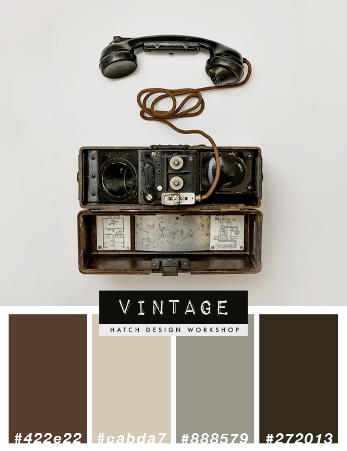
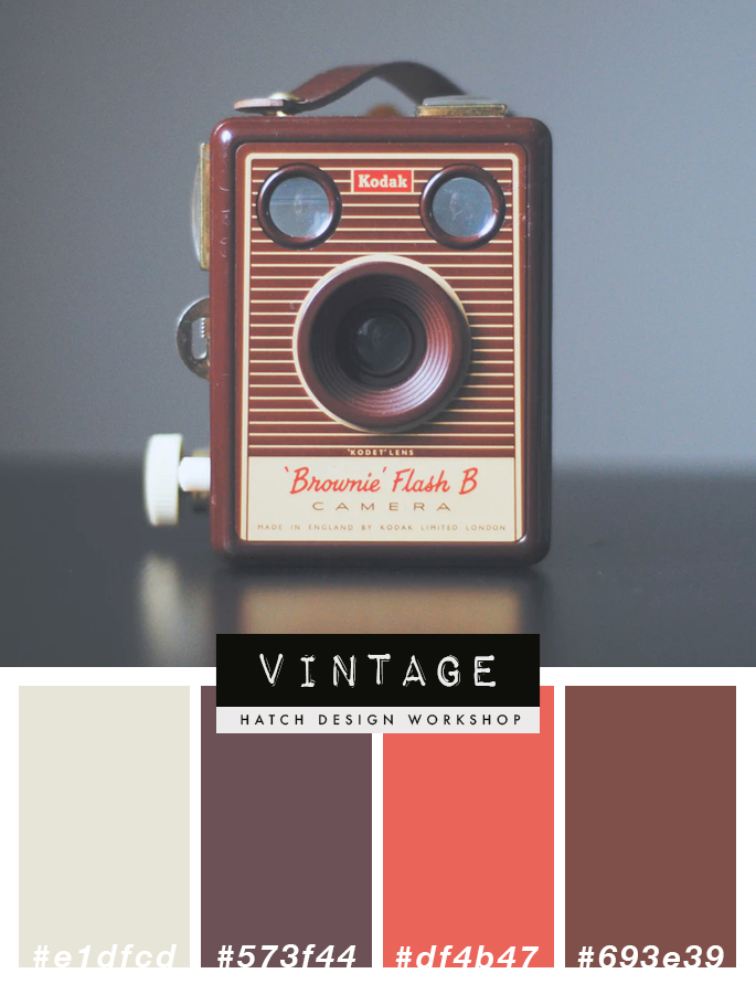
Vintage Color Palettes
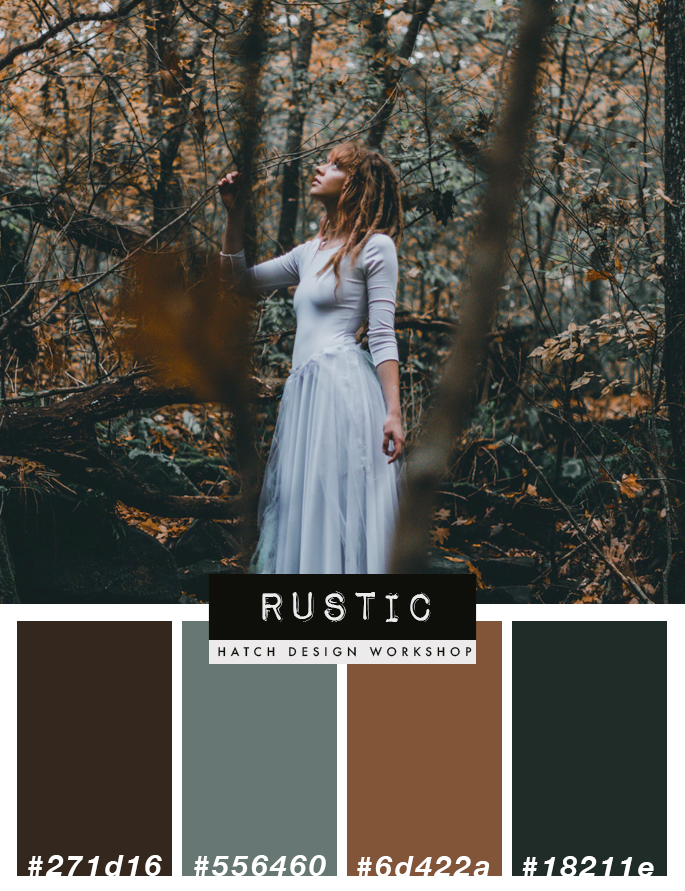
Rustic Color Palette Theme
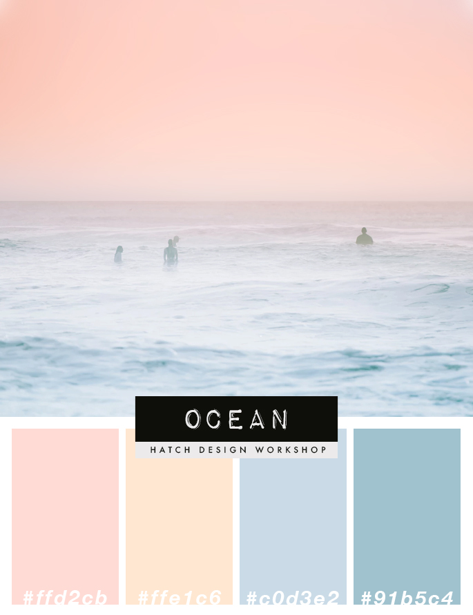
Ocean Color Palette Scheme
Feminine Color Palette Schemes
Bright and Colorful Color Palettes
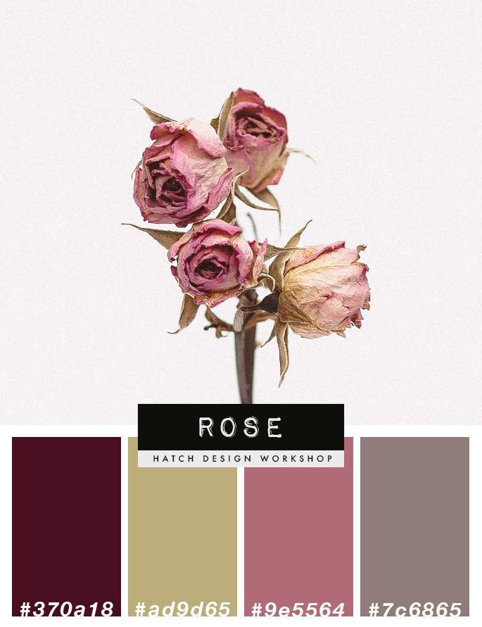
Luxury Color Palettes
Figuring Out Which Color Palette Works For Your Brand
You will need to think about what sort of image, what sort of tone and voice that you want to give to your readers.
Visit websites of brands that have a similar vibe and tone that you want to achieve and see what type of colors they are using.
Start asking yourself questions, such as “what is the tone/style that I want to create for my blog or business?”.
- Is it serious? Then you would want to avoid a bright color palette
- Is it luxurious? Then you would want deeper colors – such as rose, navy blue, royal green
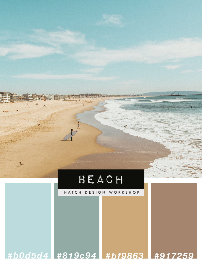
- Are you starting a travel blog focused on beaches? Then you could go with a beach styled color palette such as different shades of blues or greens, along with light shades of brown (for sand)
- Are you creating a bakery food blog or business, then would a pastel based color palette work best?
Think about the tone of the brand that you are creating, and picture what sort of colors associate with that. You can even search Google Images or Pinterest for general images based on a theme, and see what sort of colors pop up.
- A vintage tone: shades of brown, yellow, tan, sepia, black and white
- A more feminine tone: blush pink, rose gold, mint, baby blue
- A rustic tone: fall colors such as dark brown, dark orange, and greens
Selecting Your Colors
Once you know what sort of color palette you want for your brand, then the next step is to find the specific color palette.
The easiest way to find a good looking color palette is to search for one, either on Google images or Pinterest. Use search terms as “ocean color palette” if you are looking for colors for your travel blog or travel business, or “rustic color palette”. Or you can search for specific colors “pink and grey color palette”, “rose color palette”.
If you are planning on working with a designer to create your logo or website – choose a good designer, and let them make the color decisions. You can make general suggestions: “I am going for a vintage look” or “it is luxurious”. As a designer will know best when it comes to what works well together.
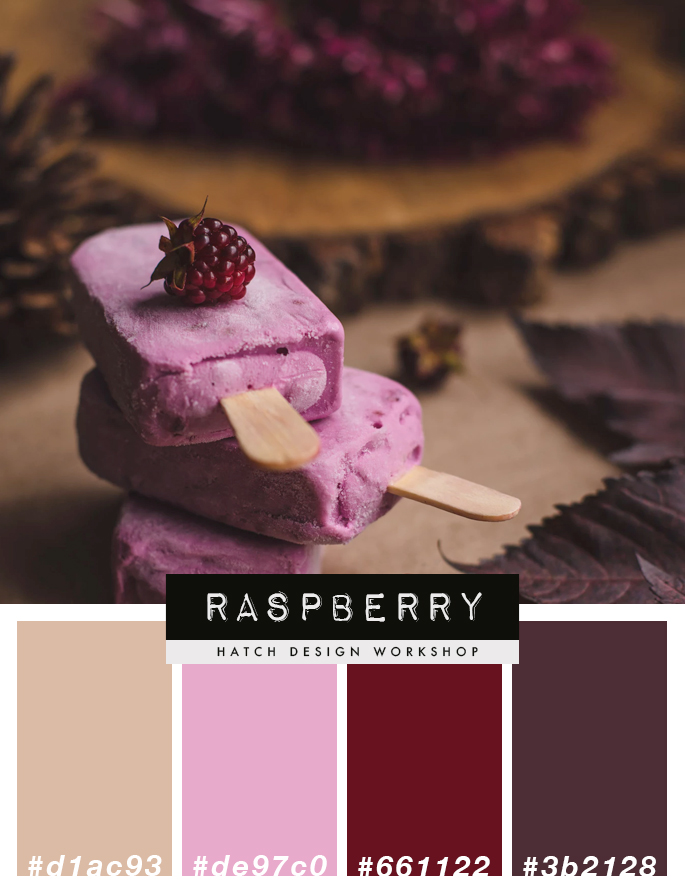
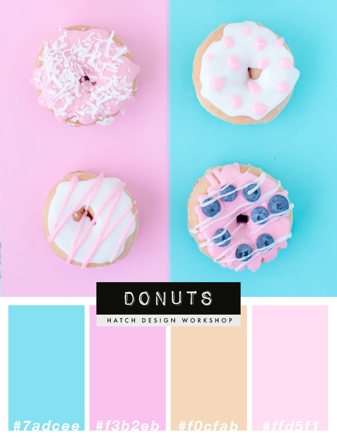
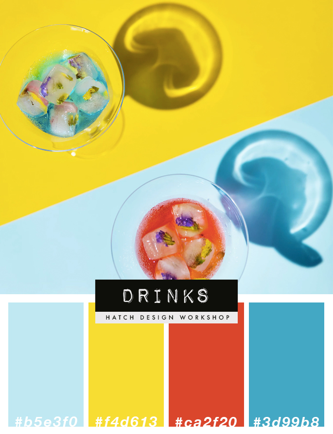
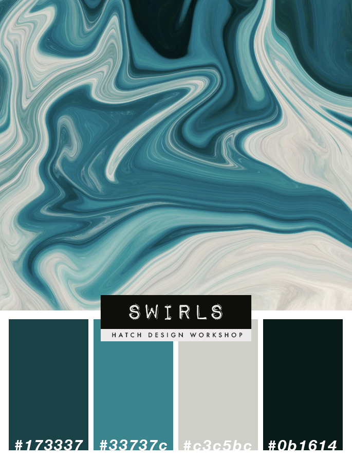
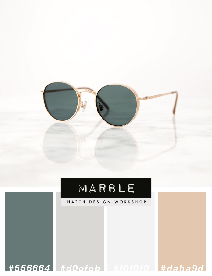
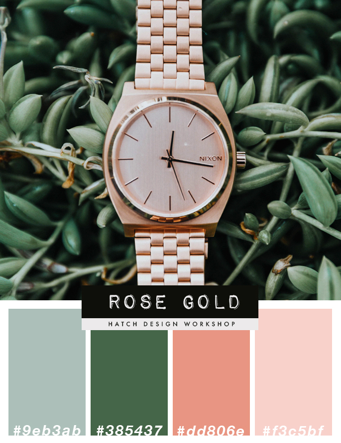
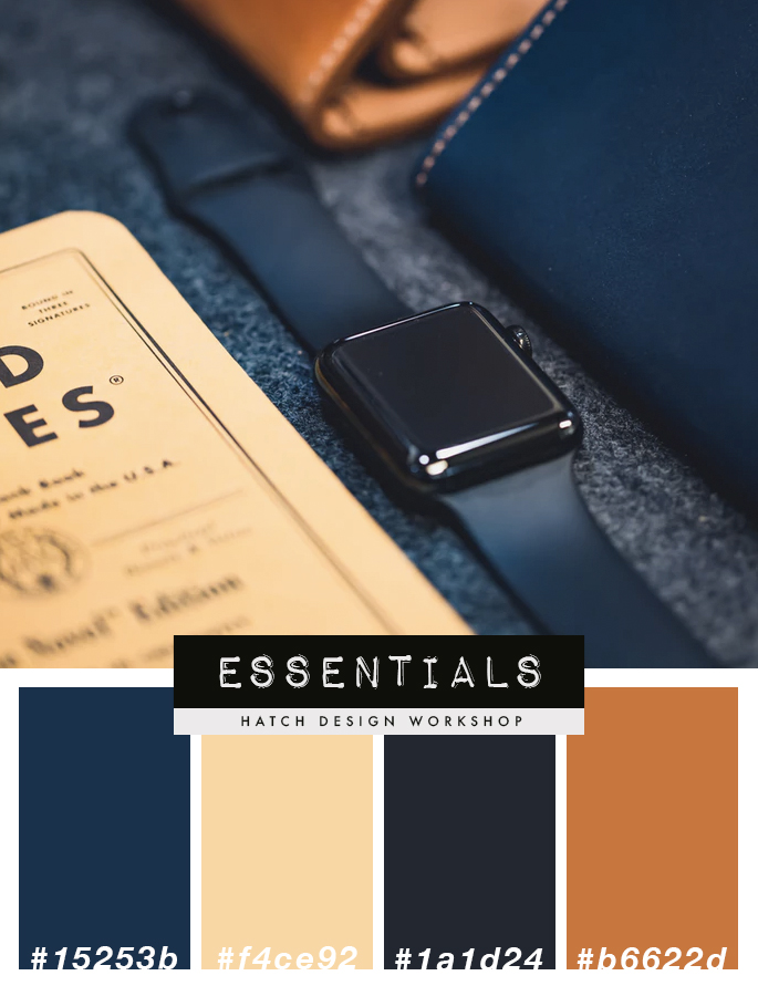
Above, I have created a number of themed color palette collections that include the hex number so you can easily use them for your logo and branding, website design, or marketing materials. These color palettes are designed so that the individual colors work well together as a group.
Recommended Reading:
